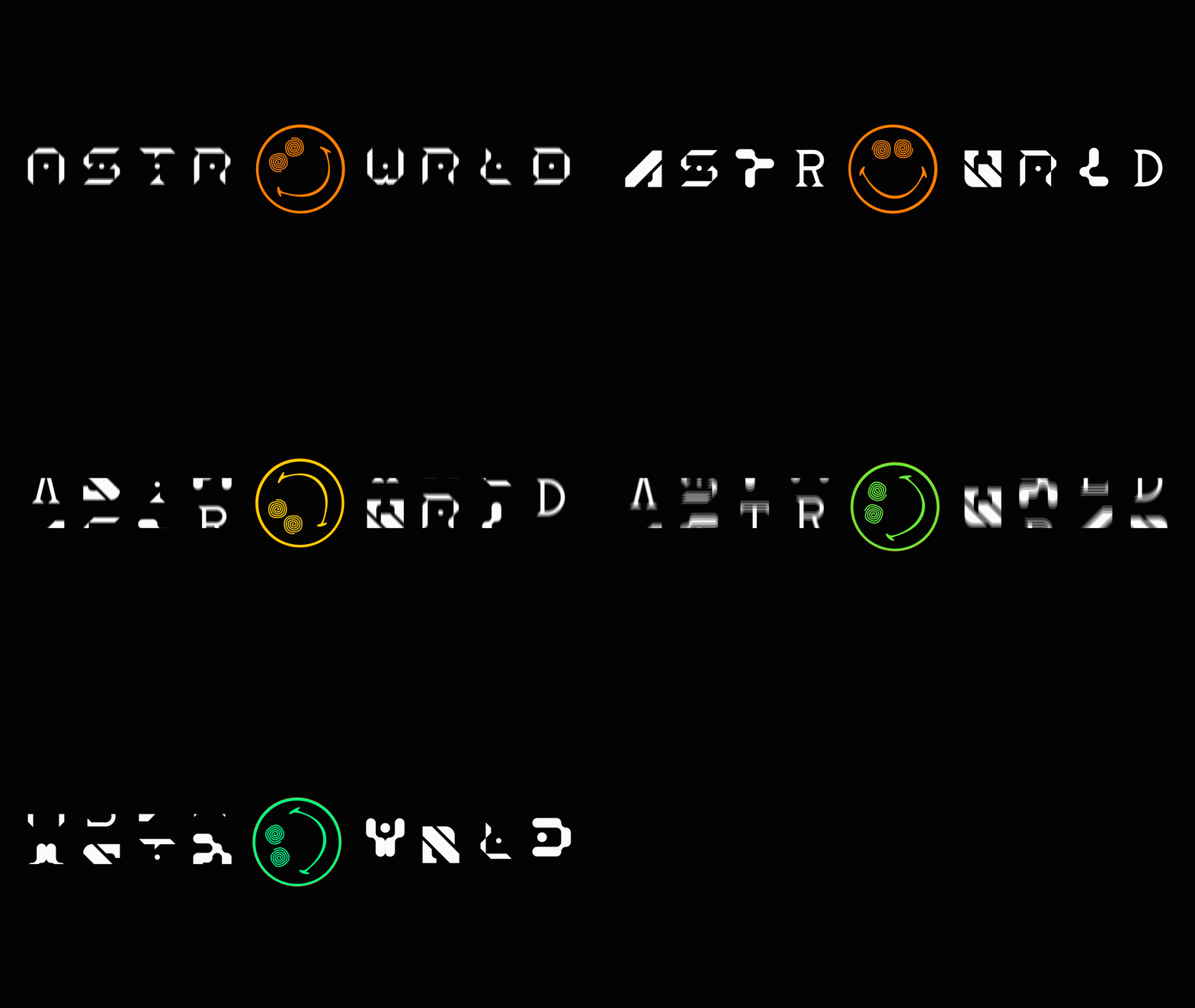
Astroworld logo.
Modular Typeface
This project took place during two different subjects on the first module of the type creation master Tipo.g.
In first place, we did a workshop with Wete, developing a modular typeface for a music festival logo (Astroworld in this case). Afterwards we made an animation out of it on the workshop with Gerard Mallandrich (Gimmewings Studio).
The idea behind the logo is to imitate an old sloth machine which combines the sets of fonts in order to create different versions each time it stops.


Under development


PRINTED RISOGRAPHY POSTER
Printed risography A5 posters.
I took a few months ago a risography course and i decided to print some samples of my ASTROWORLD project, highlighting the different alphabets i designed. I thing Riso works really well with the DYS idea behind the project.

